Moving Forward
Enhancing Commuter Experience Through Interactive Storytelling
UX/UI Design
HTML/CSS/JS
Brand Design
Research & Insights
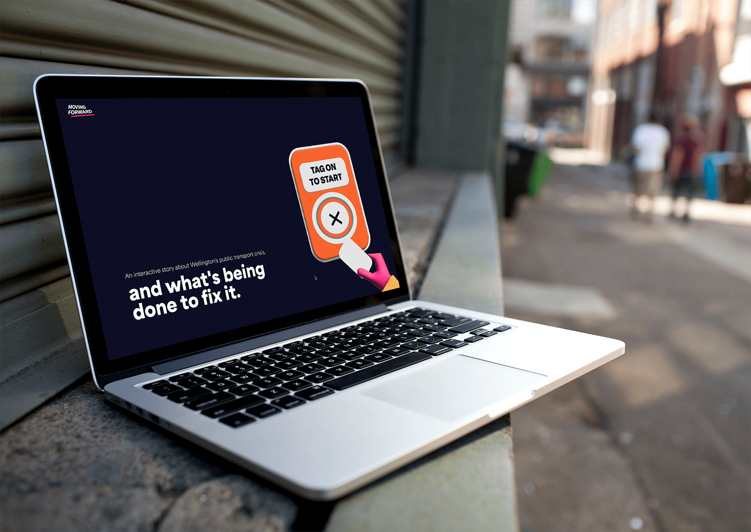
Moving Forward is an interactive story experience that educates users on the reasons behind the public transport crisis, and the exciting changes that are coming to fix it.
Delays, disappointment, and distrust—these were common complaints about Wellington’s public transport on my local Facebook page. Through my own experience and empathy interviews, I learnt that public transport unreliability leads to frustration and anxiety. The core problem was clear: passengers needed a way to feel more positive about their commute.
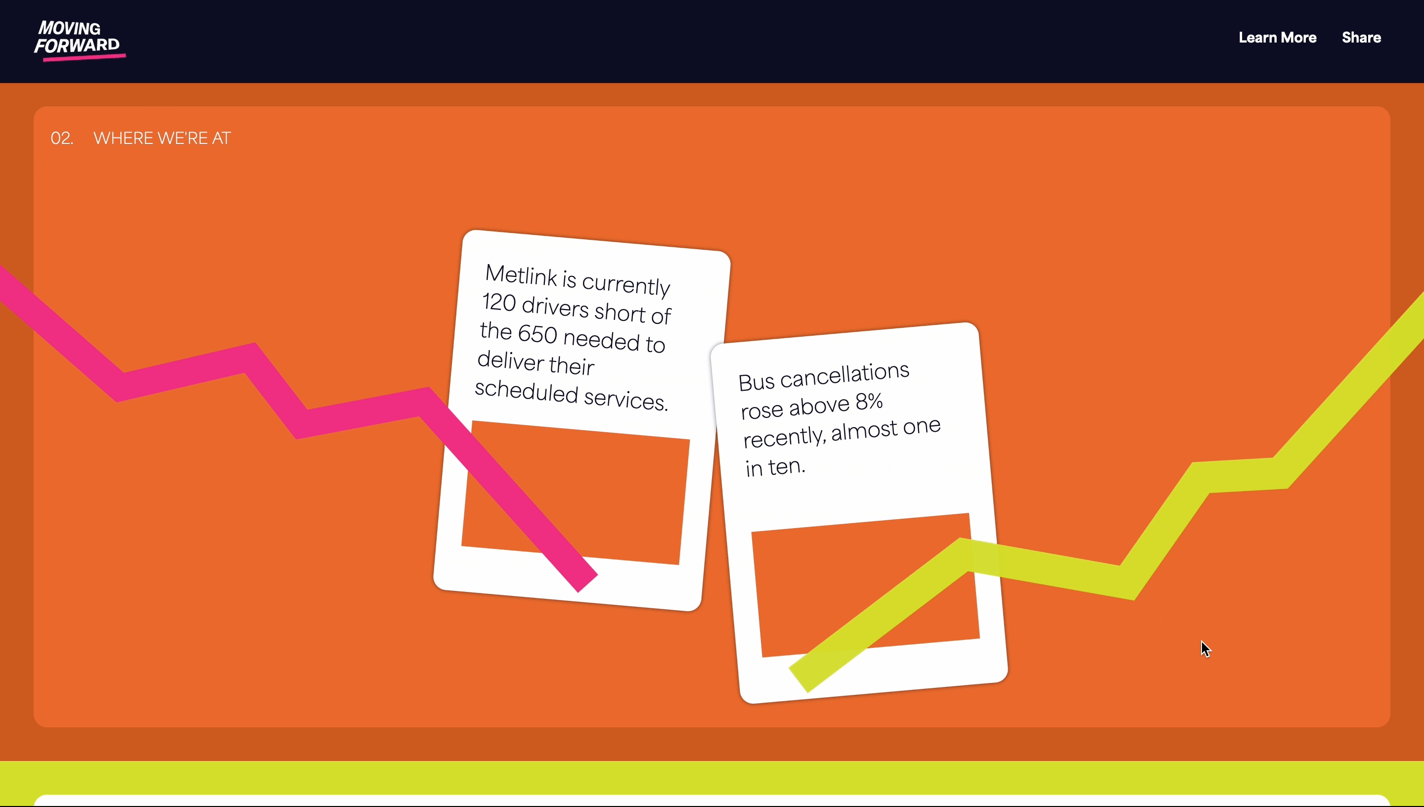
Research showed the main issue was driver shortages, but changes were underway to hire more drivers—something most people didn’t know. This led to my core insight - that by sharing this information, I could help passengers feel more hopeful about the future of their commute.

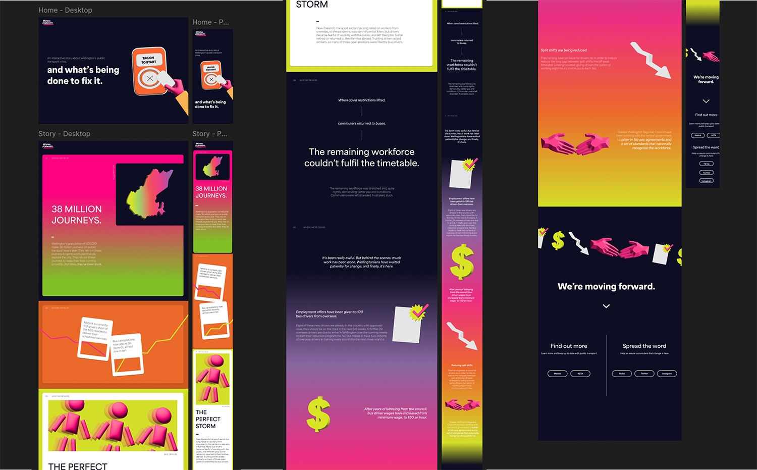
For the project’s brand identity, I was inspired by bold, vivid 70s psychedelic colours and 3D rendering trends. I chose this style as it’s relevant to the young target audience, as they are the biggest demographic using public transport.
Through field reviewing other storytelling websites, my focus became creating an engaging experience without overwhelming users with text or slow navigation. I envisioned a playful interface, using satisfying animations and bold design choices to draw users in.
I developed a moodboard to solidify the visual direction, and crafted a stylescape that communicated the vision of vibrant colours and dynamic design.

The web experience was developed through an iterative process of site mapping, prototyping, and user testing.
Initially, the story script led to a lengthy site flow, prompting a restructure. Paper prototypes allowed further exploration of layout, and feedback helped refocus on hierarchy. As a result, sections were revised, and user testing on a mid-fi prototype revealed a weaker middle section that required adjustment, though the overall layout resonated well.
After refining the hi-fi prototype, a second round of testing confirmed its engagement, needing only minor tweaks.


